DDR爱好者之家 Design By 杰米
1、开启配置自定义顶部

{
 "window": {
 "navigationStyle":"custom"
 }
}
在app.json的文件window配置"navigationStyle": "custom"属性即可
2、自定义顶部计算原理
2.1 获取系统状态栏的高度和屏幕宽度
使用wx.getSystemInfo这个函数获取系统状态栏的高度和屏幕宽度。

2.2 获取右上角胶囊位置信息
使用wx.getMenuButtonBoundingClientRect()方法获取右上角胶囊位置信息。
关键问题在于自定义胶囊的上、下和左边距。

2.3 自定义顶部距离计算代码
app.js代码如下
App({
 // 小程序初始化
 onLaunch: function() {
 // 获取自定义顶部高度相关参数
 let capsuleObj = wx.getMenuButtonBoundingClientRect();
 // console.log("==胶囊信息==");
 // console.log(capsuleObj);

 wx.getSystemInfo({
 success: (res) => {
 // console.log("==获取系统信息==");
 // console.log(res)
 var statusBarHeight = res.statusBarHeight; //顶部状态栏高度

 this.globalData.capsuleObj = capsuleObj;
 this.globalData.titleHeight = statusBarHeight + capsuleObj.height + (capsuleObj.top - statusBarHeight) * 2;
 },
 failure() {
 }
 })
 },

 // 全局缓存
 globalData: {
 loginStatus: false,
 },
})
3、封装自定义顶部
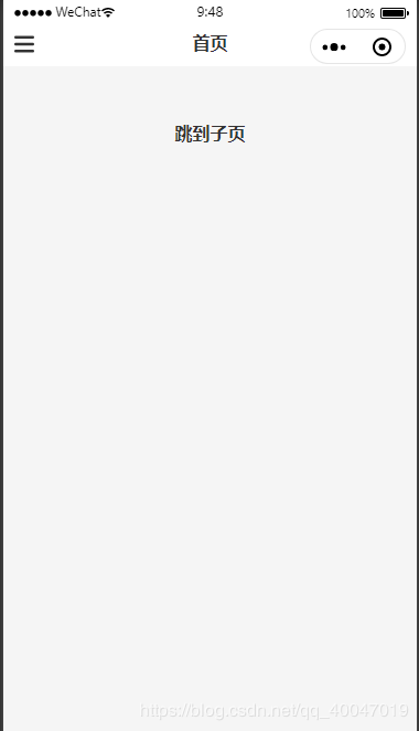
3.1效果图展示

3.2组件代码
index.wxml
<!--components/customHeader/index.wxml-->
<view class="customHeader_box" style="height:{{titleHeight}}px; background-color:{{bgColor}};">
 <!-- 菜单 -->
 <view wx:if="{{menuFlag}}" class="menu_box" style="height:{{capsuleObj.height}}px; top:{{capsuleObj.top}}px;">
 <view class="customIcon" bindtap="meunClick">
 <image src="/UploadFiles/2021-04-02/customMenu.png">

index.wxss


/* components/customHeader/index.wxss */

.customHeader_box {
 width: 100%;
 overflow: hidden;
 position: fixed;
 top: 0;
 left: 0;
 z-index: 99999;
}

.customIcon {
 flex: 1;
}

.customIcon image {
 width: 30rpx;
 height: 30rpx;
}

/* 菜单 */
.menu_box{
 text-align: center;
 box-sizing: border-box;
 overflow: hidden;
 position: absolute;
 left: 10px;
 z-index: 11;
 display: flex;
 justify-content: space-between;
 align-items: center;
}

.menu_box .customIcon image{
 width: 36rpx;
 height: 36rpx;
}

/* 返回+首页 */

.backHome_box {
 text-align: center;
 border: 1px solid #e5e5e5;
 border-radius: 20px;
 box-sizing: border-box;
 overflow: hidden;
 position: absolute;
 left: 10px;
 z-index: 11;
 display: flex;
 justify-content: space-between;
 align-items: center;
}

.backIcon {
 border-right: 1rpx solid #e5e5e5;
}

/* 标题 */

.customHeader_title {
 width: 100%;
 padding-left: 115px;
 padding-right: 115px;
 text-align: center;
 font-size: 32rpx;
 font-weight: bold;
 color: #333;
 text-overflow: ellipsis;
 box-sizing: border-box;
 overflow: hidden;
 white-space: nowrap;
 position: absolute;
 left: 0;
 z-index: 10;
}

/* 自定义顶部距离修正 */
.customWrap{
 width: 100%;
 position: relative;
 left: 0;
 z-index: 99998;
}


index.js


// components/customHeader/index.js
const app = getApp();

Component({
 /**
 * 组件的属性列表
 */
 properties: {
 customTitle: String,
 bgColor: {
 type: String,
 value: '#fff'
 },
 menuFlag: {
 type: Boolean,
 value: false
 },
 backHomeFlag: {
 type: Boolean,
 value: false
 },
 },

 /**
 * 组件的初始数据
 */
 data: {

 },

 attached: function() {
 this.setData({
 titleHeight: app.globalData.titleHeight,
 capsuleObj: app.globalData.capsuleObj
 })
 },

 options: {
 multipleSlots: true, //开启多slot
 },

 /**
 * 组件的方法列表
 */
 methods: {
 // 菜单
 meunClick: function () {
 wx.navigateTo({
 url: '/pages/menu/menu',
 })
 },

 // 返回
 backClick: function() {
 wx.navigateBack({
 delta: 1
 })
 },

 // 回首页
 homeClick: function() {
 wx.navigateTo({
 url: '/pages/index/index'
 })
 },
 }
})


index.json


{
 "component": true
}


4、组件使用方法
index.wxml


<!--pages/index/index.wxml-->

<!-- 自定义顶部 -->
<customHeader menuFlag customTitle="首页"></customHeader>

<view class="url">
	<navigator hover-class="none" url="../child/child">跳到子页</navigator>
</view>


ps:我这边封装了2个样式,meneFlag是菜单的。backHomeFlag是“返回+首页”样式的。
json配置


{
 "usingComponents": {
 "customHeader": "/components/customHeader/index"
 }
}


5、小结
此组件兼容性,可以兼容安卓、IOS、刘海屏,如果你们测试出来有新bug,可以在gitHub提出issues,帮助您解决。
链接在此:

微信小程序自定义顶部组件
DDR爱好者之家 Design By 杰米
广告合作:本站广告合作请联系QQ:858582 申请时备注:广告合作(否则不回)
免责声明:本站资源来自互联网收集,仅供用于学习和交流,请遵循相关法律法规,本站一切资源不代表本站立场,如有侵权、后门、不妥请联系本站删除!
免责声明:本站资源来自互联网收集,仅供用于学习和交流,请遵循相关法律法规,本站一切资源不代表本站立场,如有侵权、后门、不妥请联系本站删除!
DDR爱好者之家 Design By 杰米
暂无评论...
更新日志
2026年07月13日
2026年07月13日
- 小骆驼-《草原狼2(蓝光CD)》[原抓WAV+CUE]
- 群星《欢迎来到我身边 电影原声专辑》[320K/MP3][105.02MB]
- 群星《欢迎来到我身边 电影原声专辑》[FLAC/分轨][480.9MB]
- 雷婷《梦里蓝天HQⅡ》 2023头版限量编号低速原抓[WAV+CUE][463M]
- 群星《2024好听新歌42》AI调整音效【WAV分轨】
- 王思雨-《思念陪着鸿雁飞》WAV
- 王思雨《喜马拉雅HQ》头版限量编号[WAV+CUE]
- 李健《无时无刻》[WAV+CUE][590M]
- 陈奕迅《酝酿》[WAV分轨][502M]
- 卓依婷《化蝶》2CD[WAV+CUE][1.1G]
- 群星《吉他王(黑胶CD)》[WAV+CUE]
- 齐秦《穿乐(穿越)》[WAV+CUE]
- 发烧珍品《数位CD音响测试-动向效果(九)》【WAV+CUE】
- 邝美云《邝美云精装歌集》[DSF][1.6G]
- 吕方《爱一回伤一回》[WAV+CUE][454M]